


Graphic manual
Welcome to the Arcteq graphic manual! Here you can find guidelines for communication, logo use, colors, typography, and other such occasions where brand issues need to be considered.

Welcome to the Arcteq graphic manual! Here you can find guidelines for communication, logo use, colors, typography, and other such occasions where brand issues need to be considered.
This section details how to communicate technical content, and how social media and recruitment announcements are written.
We are plainspoken professionals, so strip all unnecessary noise away and aim for clarity above all. However, the tone of communication should always be friendly and service-oriented.
Our communication should be customer-centric. Instead of simply listing our own capabilities, let’s focus on how you (as a customer) benefit from our solutions. Through our communication we demonstrate that your products, processes, and business evolve with the help of our expertise.
APPLICATION AREAS
Arcteq website, catalogs, presentations, product Advertising in print/web, newsletters
KEY WORDS
Trustworthy, Serious, Professional, Informative, Formal, and Confident.
Communication on social media can be a bit lighter and more personable. On social platforms, we talk as if to a friend — casually and with a cheerful tone. While overly eccentric humor may not align with the overall brand image, a touch of playfulness is welcome. We always maintain a professional and respectful demeanor, even when delivering a social media post with a twinkle in the eye.
KEY WORDS
Friendly but informative, Humorous, Conversational, Professional, and Proud of ourselves.
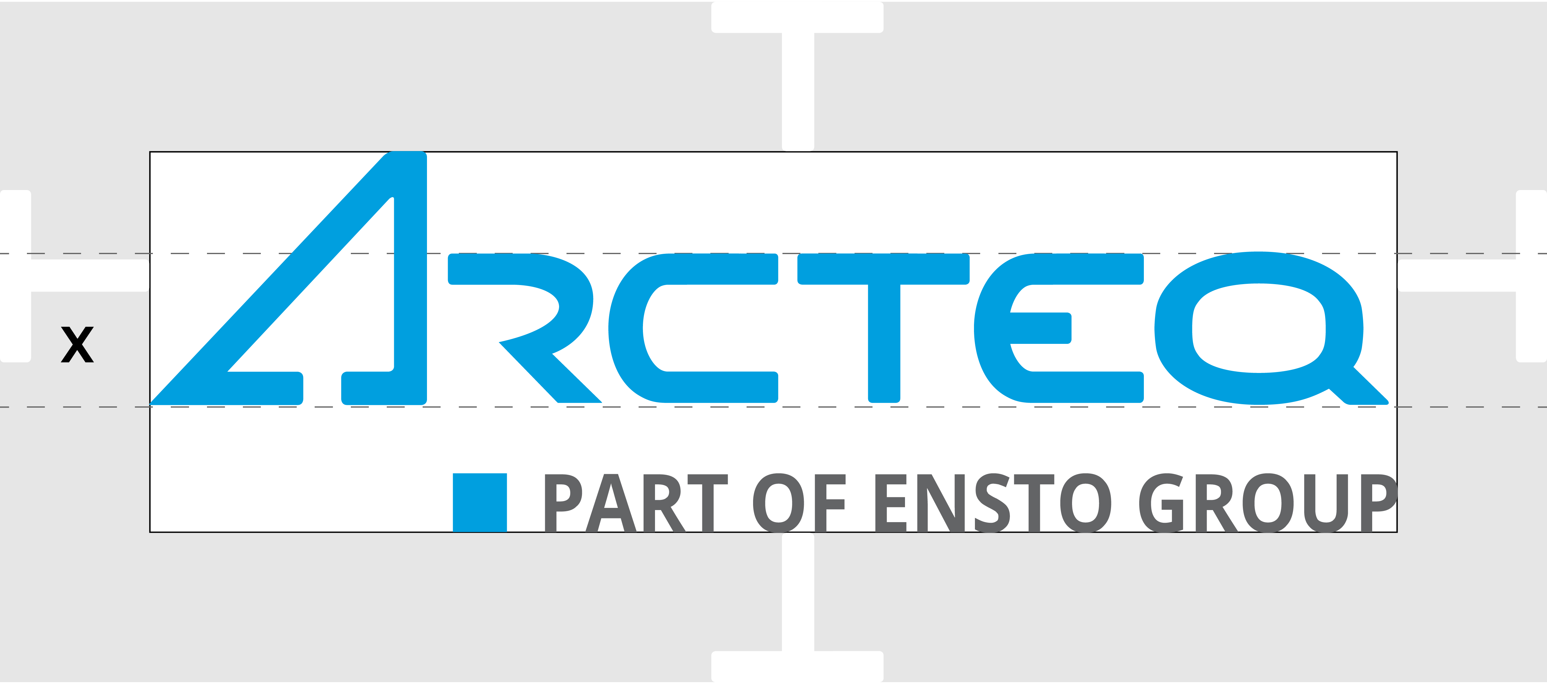
The logo guidelines define how to use our logo in different contexts, and what colors and shapes are allowed for the logo.
You can download the logo files here.
The primary logo is a typographically shaped “Arcteq” text in blue with the slogan “Part of Ensto Group”.
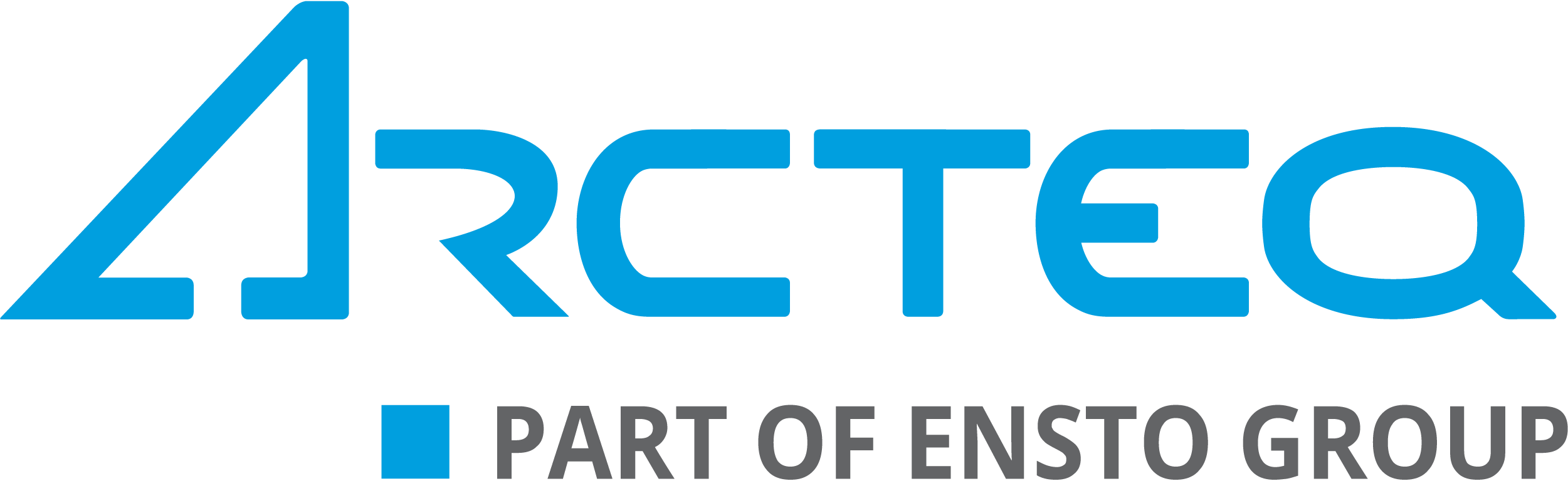
The logo without the slogan is only used in physical products!
![]()
 Pantone Process Cyan C CMYK 100 0 0 0 RGB 0 159 223 HEX #009FDF |
 Part of Ensto Group Pantone 2925 c CMYK 87 18 0 0 RGB 0 143 219 HEX #008FDB |
 Pantone Cool Gray 10 c CMYK 0 0 0 75 RGB 100 99 99 HEX #646363 |
The logo should preferably be used in its colored version.
The logo should always be placed on a simple background; make sure that it stands out!
There are also black-and-white versions of the logo (negative): those can be used when the background color restricts the use of the color versions.
If the logo is displayed as a negative, all the elements of the logo are white or black.
![]()
The logo should always be used in its original form. Do not rescale the logo or alter the colors. Only use a background where logo stands out.
BLUE ON GREY: The use of the combination gray/blue is strictly restricted to physical products! This color combination must NOT be used on web pages, presentations, brochures, newsletters, or other similar locations.

To make sure that the logo is always clearly visible, please surround it with a sufficient safety area.
This section defines the colors and typography used in brand communications.
The primary corporate colors are blue and gray as well as their shades.

Pantone Pantone Process Cyan C
CMYK 100 0 0 0
RGB 0 159 223
HEX #009FDF

CMYK 75 0 0 0
RGB 64 183 231
HEX #40B7E7

CMYK 50 0 0 0
RGB 128 207 239
HEX #80CFEF

CMYK 25 0 0 0
RGB 191 231 247
HEX #BFE7F7

Pantone Cool Gray 11 C
CMYK 63 52 44 33
RGB 84 88 96
HEX #545860

CMYK 50 37 34 17
RGB 127 130 136
HEX #7F8288

CMYK 32 26 22 17
RGB 170 172 176
HEX #AAACB0

CMYK 20 12 12 0
RGB 212 213 215
HEX #D4D5D7
The secondary colors are used to complement the primary colors. Orange should be used as the main highlighting color.

Pantone 130
CMYK 0 32 100 0
RGB 242 169 0
HEX #F2A900

CMYK 0 24 75 0
RGB 245 191 64
HEX #F5BF40

CMYK 0 16 50 0
RGB 249 212 128
HEX #F9D480

CMYK 0 8 25 0
RGB 252 234 191
HEX #FCEABF

Pantone 296
CMYK 100 48 0 89
RGB 0 19 46
HEX #111D30

CMYK 75 36 0 67
RGB 26 65 95
HEX #1A415F

CMYK 50 24 0 45
RGB 92 117 146
HEX #5C7592

CMYK 25 12 0 22
RGB 169 181 201
HEX #A9B5C9
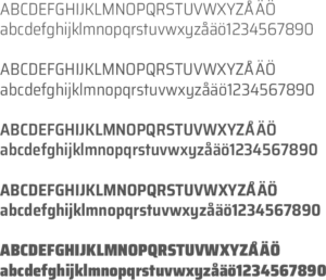
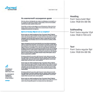
The Saira font family is used as the primary typeface in both printed and online materials.
Download the font from Google Fonts: https://fonts.google.com/specimen/Saira
The Arial font is only used when Saira cannot be used.
This section defines Graphic element, icons and images used in brand communications.
The graphic element is the letter A from the Arcteq logo.
The element is always aligned to the right as shown in the example (on the right). The safety margin has the same width as the line width.

The negative version of the graphic element is shown here:

All icons are available in blue and white.
These icons can be found in the Arcteq material bank here.
![]()
This section defines the visual appearance of various stationery, such as business cards, roll-ups, and posters.
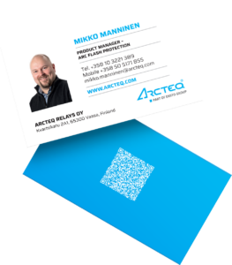
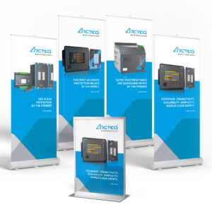
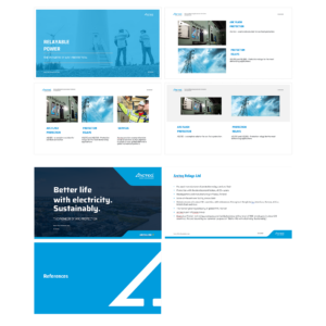
You can download the necessary assets from the Arcteq material bank here.
Please note that you need to be registered and logged in to be able to download materials.